Welcome to Barbara Joyce's Blog
March 7, 2016
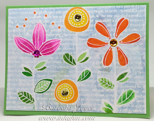
I love the background on this card, and it was fun to make. My first step was to stamp
the flowers on watercolor cardstock with VersaMark ink, sprinkle with white embossing powder,
then heat set. Then I used a
Molotow masking pen to fill in all the flowers. Next came the Ink Smooshing background.
Rub a Distress Ink color onto an acrylic block, then spray with water. Using a small
piece of acetate window sheet, pick up the ink and "smoosh" the ink onto the
watercolor paper. Repeat with the other one or two colors.
After that was dry, I removed the masking fluid and watercolored the flowers with my Zigs.
Last step was a few sequins, a few dots made with White Ranger Enamel Accents
(I love that stuff!), and Wink of Stella on the flowers, leaves and "hello."

February 29, 2016
This card was made with a free stamp set, "What I Love."" Lots of fussy cutting,
with a nice 3-D effect.

February 22, 2016
This was my week as hostess for the Splitcoast Color Challenge. I chose Wisteria Wonder,
Pool Party and Pear Pizzazz, mostly because I wanted to use my new kit from My
Favorite Things, and those are the colors in the kit. I made three cards with various parts
of the kit.
The first card uses the stamps and dies from the kit, including the vase. The
second card uses the stamps (for which there are no dies), and the third is
made with MFT Blueprints 14, and some paper from the kit.


February 15, 2016
A new-to-me technique shown by Jennifer McGuire was the
inspiration for this card. I used one of my all-time favorite stamp sets, Bloomin’ Beautiful, by Stampin’ Up!
I stamped the flower with VersaMark on a 2-1/4” x 4” white panel, and heat embossed with white embossing powder.
Then, using the direct-to-paper technique, I fully saturated the entire card with Fossilized Amber Distress ink.
I quickly and carefully painted the flower and leaves with plain water, and watched in amazement as the color faded!
Then I rubbed a small amount of Fired Brick onto an acrylic block, added a bit of water, and painted in the flower.
Then I did the same with the leaves and Peeled Paint ink. I will admit to a tiny cheat—the stem is so fine that
I decided to run along it with the writing tip of a marker, rather than try to paint it. I broke out my little
jar of Micro Glaze and tried it on this card, and I like the way it lays down a protective but invisible layer
over the Distress Ink. Unabashedly copying Jennifer’s design, I added some double-stitched lines on the card,
and stamped the sentiment at the bottom.

February 1, 2016
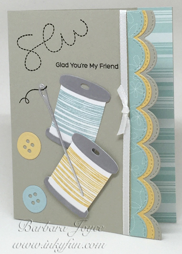
This is a quick card made with a favorite stamp set, Stitched with Love. The challenge
colors were Soft Sky, So Saffron and Smoky Slate. The dessert option was scallops. As
you can see, I get a triple serving of dessert!

January 25, 2016
Today is the 110th anniversary of my father's birth. This day is always a mixture
of sadness and joy for me. He was a great man and a wonderful father, and I miss him.
The Color Challenge this week is Strawberry Slush, Mint Macaron and Early Espresso. I
actually made this card several weeks ago, to give to our daughter, Cathy, on her birthday.
Shaker cards are very popular now, and I enjoy making them. Cathy liked the card!

I've been busy churning out a few additional cards, just for fun. The first fit in
with last Saturday's Inspiration Challenge on Splitcoast. I found a block print that looked
something like this card, and went for it. White craft ink on watercolor paper, white embossing
powder, heat set, then colored with Zig Clean Color Real Brush markers and a water brush.

I ordered a small kit from Hero Arts, and they had such terrible Internet problems that
they sent a "Sorry" gift, this pretty flower stamp (and also a bold thank you that
I haven't used yet). I had to try out the stamp, VersaFine Black Onyx ink, clear embossing, and
Zig Clean Color Markers on Watercolor paper.

Last one for today, a birthday card.

January 18, 2016
This week's colors gave me some trouble at first. I was fine with Melon Mambo and
Pretty in Pink, but wasn't happy about adding Pumpkin Pie. Then I thought about Monarch
Butterflies and this stamp came to mind. I used a new technique from Jennifer McGuire called
Easy Distress Ink Backgrounds.
I used a 5-1/2" x 4-1/4" piece of Neenah Solar White cardstock,
and covered it with Picked Raspberry Distress Ink, using the direct-to-paper technique. I laid
the piece on a board, taped my Heidi Swapp stencil on top of it, then sprayed with Tattered
Angels Glimmer Mist. You can just barely see the sparkle in the photo. Removed the stencil
and used my heat gun to dry the card. I really love this technique: it was fun to do, not
too messy, and creates a lovely background layer.

January 11, 2016
It's my turn to be hostess on the Splitcoast Color Challenge this week. Two
events influenced my choice of colors for this week. First, we recently saw a
wonderful production of "My Fair Lady." The costumes for the Ascot Races scene were
all black and white, but with big bursts of red here and there; for example, a big red flower on
a black hat. I found the combination very striking and beautiful. Second, I recently made the
acquaintance of Olivia, the adorable pig from the Ian Falconer books. This was
brought about because Ian Falconer designed the costumes and sets for the
new production of the Pacific Northwest production "The Nutcracker,"
which we recently attended. It was wonderful! The first Olivia book is all red, white, and shades
of gray and black. So my Color Challenge colors for this week are Basic Black, Whisper White and Real
Red.

Here's a closeup of the white heart. I cut the heart and punched out
all the non-flowers and leaves. Then I used my Kuretake
Gansai Tambi watercolors to paint the leaves and roses.
I cut three more hearts, poked out all the cut areas, and stacked them and glued
them together with Ranger Multi Medium Matte, to give the card some real dimension.
You can see a closeup here:

Oh! After I "finished" the card, I decided to take off the black layer
and round the corners with my new Corner Chomper. I changed the original photo, but didn't
take another picture of the closeup.
January 4, 2016
Yes, I'm still alive, and still making cards. I have sorely neglected this blog while I
have been posting to Splitcoast's Color Challenge every week. It has been a pleasure to be
on the team, and I look forward to it each week. But between the time that takes up, and
bobbin lace and needlework, this little project has been sorely neglected. It's a new year, and
I'm determined to start with the current cards and gradually work backwards. So without
further ado, here's my first card for 2016, a get-well card. The challenge colors were Pacific
Point, Cucumber Crush and Sahara Sand.

Older Posts
|